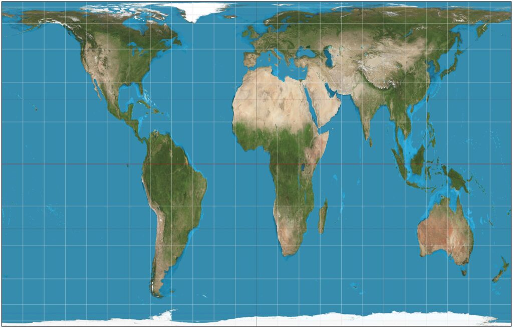
On the widely used Mercator map, Africa appears roughly the same size as Greenland, obscuring its true scale.
Advocates say the Equal Earth projection better reflects the continent’s massive size, where 14 Greenlands could fit inside Africa.
African advocacy groups have launched an online campaign urging schools and organisations to adopt the more accurate projection.
The campaign, backed by Africa No Filter and Speak Up Africa, has gained momentum across social media platforms worldwide.
“Correcting the map is not only an African issue. It is a matter of truth and accuracy,” said Fara Ndiaye.
She added that distorted maps diminish Africa’s demographic, economic, and strategic significance in global perception and education.
The African Union formally endorsed the campaign on August 14, marking a major milestone for the movement.
Mercator, created in the 16th century for European navigation, enlarges regions near the poles while shrinking Africa and South America.
Despite its inaccuracies, the Mercator projection remains common in classrooms and technology platforms, including Google Maps mobile defaults.
Geography experts call the Mercator map obsolete, suitable only for navigation rather than representing global proportions accurately.
“Outside of navigation, there is no point in using it,” said Syracuse University professor Mark Monmonier, a map specialist.
Projections like Equal Earth better reflect continents’ true size, though experts suggest bar graphs remain ideal for size comparisons.
Campaigners hope the shift will educate future generations about Africa’s real scale and global significance, correcting centuries of distortion.